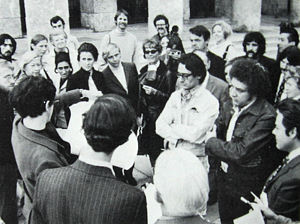
In the summer of 1970 I was approached by Curtis Coley, Director of the Ringling Museum of Art in Sarasota, Florida, to select the works and write the catalogue introduction for an exhibition of contemporary Canadian painting and sculpture. It was to be the first traveling exhibition of Canadian art to appear in the United States for 26 years. What follows is the illustrated catalogue introduction to this show which opened there on February 14th 1971 and later opened at the Museum of Contemporary Art in Chicago. The Department of External Affairs helped subsidize the venture and, some years later, borrowed the same title for a new gallery showing Canadian art in New York.
I decided that the catalogue should begin with a general introduction to post war II Canadian art to orient the interested American reader and, since the catalogue would go on sale in Toronto, give general guidance to those Canadians who might be oblivious of their country’s contemporary visual culture as it had developed during the 1960s. For ease of reading in this web site format I have inserted sub-headings. I should also ask the reader to bear in mind that the subtleties and references mentioned in the text (and illustrated separately from the text in the original catalogue) are not always possible to illustrate here.
A Brief Survey of visual art in Canada 1950–1970.
In the past two decades the visual arts in Canada have undergone an astonishing revolution. New universities and community colleges have sprung up, complete with studio courses and applied-art workshops, all over the country. The major cities have extended municipal art gallery facilities or built handsome new ones, and hardly a small town is without some sort of exhibition space paid for by the tax dollar. New art dealers have appeared, one with the world’s most sumptuous private exhibition space, and a number of cosmopolitan “scenes” have developed in Canadian cities across our three thousand miles of land mass, while creative activity, once mainly confined to Montreal and Toronto, is now found throughout the nation.
No doubt this emergence has resulted from American cultural overspill, as well as from an economic boom that rests in great measure on American capital; and certainly it has been accompanied by the weakening of bonds with Europe. In this respect, however, Canadians remain concerned that they do not exchange one form of dependency for another, and tendencies to cultural protectionism at the levels of both popular culture and state education have appeared at the same time as Canada’s acceptance of internationalism. So far, however, this has not affected a lavish federal government scheme which has supported Canadian artists since 1957 with non-repayable grants of the sort begun in the U.S.A. only last year, and which remains uninhibited by the fact that recipient artists may use such grants to enable them to live in other countries, including the U.S.A.
Vanguardism in Canada came late. Between the world wars there was a notable school of landscape painting which, though uninfluenced by the Armory Show, may be seen as a bucolic counterpart to the urban and industrial landscape painting of the United States (whose iconography would then have been completely inappropriate in Canada). So it was 1940 before a determined avant-garde arose, first under the influence of Paris and then under that of New York—the impact of the latter displacing an enfeebled English romanticism which had survived among artists and collectors into the fifties.
The influence of Paris was predictably on Montreal, which remains the second largest French-speaking city in the world and which in 1940 was therefore as prepared to receive Europe’s migratory Surrealists as New York itself (where Breton refused to speak English, probably because he had never learned it). Indeed, it ought to be better known that Montreal made from Surrealism an Abstract Expressionist style of its own, quite independent of New York, under the inspiration of the French-Canadian painter Paul-Emile Borduas, who by 1944 had developed a completely non-figurative “automatisme” and was an important influence on Jean-Paul Riopelle, the best-known Canadian painter of the fifties. Neither has the confidence indicated by this achievement been dissipated; it survives particularly in a hard-edge style that began in the mid-fifties and which we see brought to a peak in the present exhibition by Guido Molinari and Claude Tousignant.
Toronto’s adoption of a similar vanguardism came almost a decade later, when news arrived not of Borduas (although he had a substantial show there in 1951) but of New York “Action Painting.” The reason for this lies partly in its commitment to the landscape school already mentioned, partly in an Anglophilia suspicious of Quebec and partly in a language barrier which deprived English-speaking Canadians of access to French thought until it had been translated—for instance a now famous manifesto by Borduas, Refus Global, had to await translation by a British critic! This alienation has now been reduced by the official establishment of Canadian bilingualism and also by the fact that in its new-found affluence Toronto has displaced Montreal as the exhibiting center of the nation and increasingly attracts French-Canadian artists.
Even more recent has been the flowering of the West Coast, the Prairies and the Maritime Provinces, regions which have developed partly through influences also from below the border. The Prairies, for instance, have produced a rather confined “Structurist” movement (led by EIi Bornstein, a native of Wisconsin), and a “Modernism” introduced by the American critic Clement Greenberg. Vancouver, once an outpost of British orthodoxy, has gained illumination from San Francisco and Los Angeles; and a revolution at the Nova Scotia College of Art and Design in Halifax, although too new to have produced mature artists, stands to make it the Canadian locus of counter-culture aesthetics. Swept by such influences, a certain guardedness among Canadians is understandable. On the other hand, as the tide of outside influence recedes it reveals a sea-change, as visitors to the exhibition will see.
Brian Fisher in Vancouver
The connotation “West Coast,” regarding Vancouver’s art, is especially well exemplified in the exquisite surfaces and subtle light of the paintings of Brian Fisher. So strong is the redolence of place, indeed, in his non-figurative canvases that their poised and sensuous classicism seems to reach from California’s Venice almost to the Venice of Canaletto, or the seaports of Claude. This is especially so when one realizes that these lambent, meditative icons—using line as a vehicle for light—transcend a coldly intellectual linearity through a device used frequently and almost uniquely by those earlier masters. At the same time it is obvious that Fisher’s work is also keyed to the procedures of European Constructivism (as, for instance, in the works of Gabo or Pevsner), and he shares the view of those who believe that “the definition of structure itself has become the subject.” But when that has been said, the transcendences remain—as with Gabo and Pevsner—and the coordinates on which he weaves his linear webs turn out to be a loom for the weft and warp of profoundly perceptive intuitions.
Jack Chambers in London Ontario
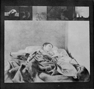
The one figurative artist in the exhibition, Jack Chambers, is also preoccupied with light, but to a different end. Chambers’ is an expressionist aim, and often the converse of serene—a mixture of memory and ominous prognostication which he distills from photographs and embalms in moody subjective light. A renegade contemporary, he chose to stay with and “work through” his childhood experience of art (regional, figurative and Baptist) finally deciding to study at the Madrid Academy while his peers were joining the academy of Pollock and de Kooning. He is represented in the exhibition by graphite drawings and vacuum-formed, plexiglas reliefs, which show him turning latter-day materials to the service of his special luminary style. His consistent use of photographic sources since 1959 has evolved recently into an uncompromising objectivity (close to that of several painters in last year’s “22 Realists” exhibition at the Whitney Museum).
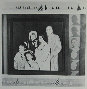
Here, however, although his study material is evidently movie frames or snapshots he remains the painter of moods—which range from the joyous “Moving Side and Forward,” through the vague uneasiness in a drawing of his sleeping son, to the foreboding atmosphere of “Regatta” and the positive menace in “Bird Plant” where life is represented out of its element and bird and plant are apocalyptically transposed—a dark epiphany, derived perhaps from childhood visions, like Whitman’s vision of the mocking bird—and setting Chambers’ work apart.
Toronto’s Joyce Wieland in New York
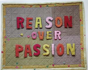
It may seem strange at first to learn that Joyce Wieland is an artist with some affinity to Chambers’ regionalism and his preoccupation with the sombre side of life, for when such themes entered her work at the beginning of the sixties, they did so with an irrepressible erotic buoyancy, derived partly from her experience as a film animator. Had she been in the London of David Hockney when she began such works in 1961, she would have gained an immediate reputation: but, more volatile than Hockney, she took off towards a different type of bathos and after a period of brilliantly conceived sardonic paintings turned to collage and assemblage methods that brought her eventually to the quilts in the current show. These derive not only from her ’pop’ preoccupations but also represent Wieland’s avid Canadianism: the quilting connects her less to someone like Oldenburg than to the folk roots from which, although she lives in New York, she feels her country draws its vitality. There is a certain cheery irony in this, of course, and, true to her earlier affairs with Eros, Wieland’s attention extends not only to the quilting but, by implication, to the bed beneath—even (or perhaps particularly) when her titles proclaim a political point of view. A determined Canadian protectionist, she draws an inevitable sexual metaphor when she emblazons a quilt with such slogans as “J’aime Canada” (and then, in smaller embroidered letters, “a bas I’imperialisme technologique des E.U.”); or when, in a burst of enthusiasm for Canada’s romantic bachelor Prime Minister, she presents him with, and he accepts, a quilt of matrimonial size on which is inscribed his election slogan “La Raison avant la Passion” (an English language version of which is in the exhibition). Such good-humoured creations can be explored as deeply as Freud’s reflections on wit, as can the fact that Wieland’s “patriotic” works are soon to have a special showing at the National Gallery of Canada, across the road from the nation’s Parliament. Other works in the exhibition are slightly earlier than the political quilts, and signify her two other preoccupations, movie-making and the occult (“Film Mandala,” indeed, is a condensation of the two, and wraps together Freud, Jung and the New York Filmmakers’ Cinematheque! But it reveals, too, an element of contemplation that has not appeared elsewhere in the artist’s work and which gains a quite majestic strength in another quilt in the show, the all white “Untitled” of 1966, which sings out a moment of oceanic feeling in an artist otherwise very much in the workaday world.
Toronto’s Michael Snow in New York
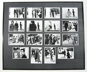
Michael Snow (Joyce Wieland’s husband) is the author of a very different art. Snow, also a movie-maker, has achieved celebrity in the last few years in this medium with a number of profoundly original works, one of which, “Wavelength,” gained him the grand prize in 1967 at Belgium’s 4th Experimental Film Festival. These movies, like much of his plastic expression over the last decade, reveal that Snow’s art proceeds from a deeply philosophical turn of mind—one which it is possible to trace back even to works of his childhood. Consistent with a fascination in those days with the transformations of visual reality brought about by his box camera, he remains concerned still to isolate and give form to the different vectors that determine vision. These lay, for instance, in the words that we attach to things and to operations, the media through which things or operations are perceived or recorded, the referential nature of objects, and the metaphoric tendency of art. Thus, in the early sixties, Snow became known for his use over some five years of only one, constant image—a walking woman silhouette which he repeated in a vast variety of styles and media, reversing the procedure of artists who, characteristically, change their motif while retaining a consistent style. Later, as he moved into film, he created a series of devices or “sculptures” which removed the usual meaning of the world by framing it in unpredictable ways. This activity, a form of non-verbal phenomenological investigation, was developed further in objects and movies which have reified (elevated to the status of a “thing”) the actual processes of their making, which can also be found in his works using still photography like the more recent of those in the exhibition. The first of the present works, however, “Four to Five,” is included as an example of Snow’s prescience in formulating as early as 1962 a concept of the “documentary art” seen everywhere today, in which the Walking Woman is recorded in public locations that push her ontologically nearer to the status of the living people while they, in turn, are pulled nearer to her status (of image) by the fact of being photographed.
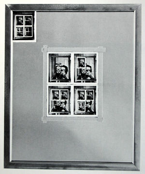
The development of the Polaroid camera since then has significantly enriched Snow’s potential. In “Authorization,” for instance, Polaroid technology enables him to confront camera and mirror in an ironic parody of the classical “infinite regress.” At first, the work seems to imply the same infinities of images that one can generate by using double mirrors, but closer inspection shows that the regress cannot be infinite, and that when the camera begins its enumerative process the regress is foredoomed to end in its fifth term: it has not been “authorized” except by our error of perception, although it is this potential error which has “authorized” the work in the artist’s mind - just as his own inevitable presence in it donates another level of meaning to the “authorization.”
A more recent piece derived from puns and Polaroids was conceived last year in Venice, where Snow represented Canada at the Biennial. “Venetian Blind,” that is to say, is another work titled to pun on the process by which it was made as Snow aims the Polaroid camera backward over his shoulder while boating or walking by the monuments of Venice, as a Venetian blind obscures the view but lets in light (and operates like a camera shutter) so this process becomes a play on the obscured and the half seen: he records what was there but what could not be observed except through the Polaroid camera’s operation. Later the results are mounted in a fictitious sequence according to the angle of the sun’s light on the artist’s face.
These elements of chance, the inclusive role of the artist as subject and object (partly negated by his blurred and shaking head), Snow’s own shuttered eyes, the punning title, all illustrate his debt to the “other” tradition of the late Marcel Duchamp. Indeed, Snow takes Duchamp’s position that if anything can be assimilated to the aesthetic realm, then our attention can move to the ontological and epistemological mysteries that accompany its perception: in Duchamp’s words, to the creation of “a new thought for that object.”
Toronto’s Les Levine in New York
Like Snow, Les Levine and lain Baxter (see later) owe a debt to Duchamp. But although all three share Duchamp’s anti-retinal attitude and elect for an art with intellectual edge, in fact their paths diverge. For instance, Snow’s use of photography is to make an object that both probes the nature of the ’real’ and embodies the processes of its own making: the photography only incidentally refers back to some previous event, since all that it has to give is “present” to us. This is not the case with either Levine or Baxter, whose photographs are mostly records—cues to re-evoking prior situations. For Snow, the camera connotes a mystery; for them, it is a useful instrument. The distinctions that remain between Baxter and Levine, however, are best approached by separate consideration.
Partly because of the nature of his art, Levine has become in the last two or three years one of the world’s most frequently exhibited living artists, which is surprising when one considers that his art involves the sapping and mining of the ground on which both he and other artists stand. These even include the chef d’ecole himself, as when Levine illicitly photographed Duchamp’s last work, in the Philadelphia Museum, and created out of it a “multiple” of his own. But although it may seem that Levine’s is a succès de scandale, this is not at all his central aim.
Based on insights from communications theory, consumer research and the mystique of Marshall McLuhan, Levine launched himself in 1964 with an exhibition of sculpture that he proposed to market with the customising options of a motor manufacturer. Soon afterwards, however, he concluded that, in an electronic age, art objects were redundant and that he must work towards defining an “environmental” aesthetic. For instance, he mass-produced unlimited numbers of vacuum-formed plastic panels, which at two dollars each could be bought to transform the interior of a room and were as disposable as Dixie cups. Art, he held, should be transient and experienced on the move, and even function as an “aide identité.” In several works that followed he therefore included TV monitors, and Levine’s Restaurant, which appeared on Park Avenue (and served excellent food) was bare except for batteries of television cameras that scanned arriving customers and monitored what they ate. Or there was “Electric Shock,” in which the viewer received his “charge” directly from a V.H.F. current carried by wires above his head, and saw himself receive it on the monitor—a first unmediated art experience!
These works, establishing a feedback system for the viewer’s physical identity, were followed by others that exposed his psychological identity. Involvement with Levine became, in other words, a risky business. If the support system behind visual art was serving to obscure the fact that art had become a non-aesthetic category, then someone ought to dramatize the fact, and Levine proceeded to do so by a series of ironic and bewildering events. He organised an exhibition by members of the New York Architectural League called “Your Worst Work” (some critics said it was not bad enough!), produced a piece called “Wire Tap” by bugging his own telephone and recording his callers, and, asked to participate in the Paris Biennial, he chose to make his entry the award of a prize (the “Prix Levine”) equal to that awarded by the French Government and presented, on the day before theirs, to two artists who had had the wit to offer, in the best tradition of biennial wheeling and dealing, to share it with him! Other works have included “Paint,” at the Molly Barnes Gallery in Los Angeles, for which sixty gallons of paint were poured on the gallery floor as serried ranks of movie cameras rolled (the old, bankrupt, paint medium now transmuted to environmental form but symbolically consumed by the new).
In this context “Red Tape, A Ten Act Play” and “Culture Hero, Master Print” (a reproduction of one entire issue of Culture Hero, Levine’s own journal of put-down and send-up) will be self-explanatory. “Red Tape” is the result of his attempt to install an aesthetically neutral art work in the Student Centre of the University of Toronto—one consisting of a scheme to suspend on ropes above the quadrangle a large quantity of building material which, as the records here show, unveiled with diabolical precision the Centre’s administrative system. But if “other directed” consumers think their role is merely to enjoy the spectacle, they find Levine has turned attention to them too, with instructions that ask them to ape the current clichés of “advanced” theater (in a ”Ten Act Play”) as they read the work. Like the masters of exposure of the past, Levine forces us to become more aware of ourselves; and, needless to add, the flak that he receives is sometimes heavy: “the rage of Caliban seeing his own face in the glass,” as Oscar Wilde once put it.
Vancouver’s Ian Baxter
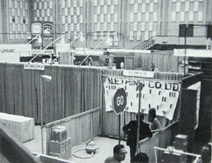
Data Processing Conference, Seattle, 1970
While the effect of much of Levine’s work is to make us more conscious of ourselves as players or spectators in the art game, the activities of Iain Baxter take our attention away from art and towards the world. Thus, Baxter operates from behind the facade of “The N. E. Thing Company Limited,” an organization staffed principally by himself and his wife Elaine, which permits him to transcend the category “artist” altogether and, where Levine lives in New York and gets under the skin of the toughest art community ever known, Baxter, with the world as his oyster, remains content to live in suburban Vancouver. This difference partly accounts for the sardonic note in Levine, which in the activities of the N. E. Thing Company is missing. Indeed, there is the same fundamental warmth in the activities of the “Company” that one finds in Wieland—and Baxter’s earlier essays in inflatable art share something of the aesthetic of Wieland’s quilts. On the other hand, where Wieland continues to make “fine art” objects, Baxter, like Levine, has renounced objects in favor of a more total, though more diversified, use of the environment, and, in the same way as Levine, is “software orientated.” The N. E. Thing Company, that is to say, exists to process what it calls “visual sensitivity information,” or ’V.S.I’, a position at which the Company has arrived since its formation in 1966 through a series of departmental expansions as the president has conceived a new style of activity or expanded his sphere of operations to another area of life.
Baxter’s unseriousness is determinedly serious; he has devised extensions to other people’s work (an extra annular area around an Albers; water for an Oldenburg toilet; and even an extension to the concept art of Lawrence Weiner who, when he proposed “an object tossed from one country to another,” found that Baxter had added, “and back again.” He has defended his inflatable sculpture on the grounds that it was deflatable and, in the tradition of Duchamp’s “Reciprocal Ready-mades,” claims to have returned canvas to its appropriate function by using it for tents and awnings.
Among its activities, The N.E.Thing Company issues certificates, as appropriate, to the owners of “things.” Of these there are two types: “ACT Certificates” are issued to the owners of “aesthetically claimed things,” and “ART, Certificates” are issued to owners of “aesthetically rejected things.” Compared with Levine’s acerbic demolitions this may seem no more than a good-humored poke in the ribs, though when related to the Company’s many photographic, elemental and landscape projects, it has its place as a lesson in the disjunctive nature of the concept of art today. But perhaps the Company’s greatest success was achieved last year when the Baxters rented a booth at the International Data Processing Conference in Seattle, where its mysterious, serio-comic presence commandeered almost the entire media interest in the event. During the conference Baxter gave an address, issued buttons extolling “Gross National Good” and finally sold the computer card blow-up that identified his exhibit for a sum that covered his expenses. It is significant that “straight” members of the conference took him much more seriously than they might have if he had appeared in the local art gallery. In such activities however (and there have been others) he extends the category “visual art” to merge with that of “Living Theater” or social psychology—possibilities foreseen and avoided by Duchamp but which may well stand to “reconcile art and the people” where those of the aristocratic Duchamp, of whom this prophecy was made, did not.
The N.E.Thing Company’s submission to the present exhibition (from its self-styled “Photo and Communications Department”) takes a place in that contemporary genre which draws our attention to improbable or unusual viewpoints, or the synchronicity of events in time and space. In this case, six photographers were programmed to take photographs at the same moment in time, in the six North American time zones, of the same traditional “art’ subject. The resulting photographs, accompanied by synchronized clocks, have the effect of replacing our linear concept of space/time with the apprehension of what might be called a simultaneous space/time mosaic.
Toronto’s John Meredith and Peter Kolisnyk
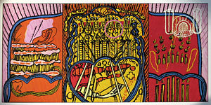
Turning again to painters, two who pursue different but equally lonely courses in Canadian art today are John Meredith and Peter Kolisnyk. One might call Meredith a visionary painter. In the early sixties he emerged from the sunset of Toronto’s Abstract Expressionism with canvases that showed bold, uncomplicated designs brushed freely through a single field of colour. “Presence /I” (in the exhibition) is typical of these. Slowly, however, they gained a greater and greater complexity of detail, and one began to notice the appearance of whispy, ciliated edges to each brushslroke which gave the painted surface a mysterious, iridescent gleam. Meredith’s work has obvious affinities to the early “non-objective” paintings of Kandinsky’s, though it is not improvised but worked from preliminary drawings. At the same time Meredith resists in these drawings the psychedelic identity of such an artist as Michaux, even though their tucked and stitched qualities connote an attachment to the tapestry and apparel of Oriental culture. In the present exhibition “Seeker” and “Ulysses” show him at the height of his powers, replete with elusive meanings and brilliantly handled suggestions, where micro and macrocosm, organic and inorganic, the ominous and imminent are locked into designs of great mobility and control.
Kolisnyk’s work follows an opposite direction. it is concerned with reticence and holding back—with the aesthetics of austerity – and, as with reductionist art elsewhere it has become modular and monochromatic. But Kolisnyk has arrived at this point through a highly personal pursuit.
Arshile Gorky once wrote, “every time one stretches a canvas he is drawing a new space” and Kolisnyk’s concern has been to use this space as a motif: to use the support itself against actual space without violating its integrity as canvas. Among his early works are some that resemble shallow open boxes, painted in a primary colour and mounted centrally on a white canvas or used to bridge two canvases arranged one above the other. In this rather European-American manner (one thinks of Albers or Diller) Kolisnyk thus began to come to terms with what has occupied him since. His first unified attack on the problem he had set himself was to get rid of colour and reflected light in favor of a non-reflective charcoal-brown pigment, rolled uniformly onto canvases which were then mounted as units within one deep box-like frame. But the subtle play of shadowy surfaces and gloomy depths where space was left between each canvas, seemed too complex and too romantic (shades, indeed, of Nevelson and Bontecou), and were followed by the much simplified, freestanding “Floor Piece VII,” of 1967. This work retained the strategy of the deep frame, sucking actual space into the pictorial canvas space and, by descending from the wall, as sculpture had recently descended from the plinth, it also activated the spectator’s space. But fascinating as this solution was (it was very close in some ways to McCracken’s leaning plank sculptures produced the same year) it still carried a dramatic ballast and, finally determined to exorcise this, Kolisnyk followed it in 1968 with his B-Part “Space-Composition,” a first modular work, located, not on the wall but, by virtue of the chamfered edges of each unit, in front of it—thus activating not only the illusionistic, pictorial space of the painted wall between each module but also the shallow actual space between them.
These newest works remain wall pieces, but the space between each module is now diminished to a hair-line, whilst the use of pigment and the “composed” quality of the former works has been eliminated in favor of bare canvas and regularity of structure. This steady erosion has been practiced by other reductive artists, of course—especially since Frank Stella produced the idea of “non-relational” composition in 1960, so has the method of construction by abutting modular units (used most conspicuously by Carl Andre). But Kolisnyk’s achievement is to have come to it pragmatically, in pursuit of a strictly personal end, and to have produced en route the theses of a fascinating dialectic.
Molinari and Tousignant: French Canadian colour Painting
Perhaps the most richly exploited contemporary genre in Canada and certainly the one for which Canadian artists are best known abroad is colour painting—represented in the exhibition by four artists: Guido Molinari, Claude Tousignant, Jack Bush and Kenneth Lochhead. It will be apparent however that special affinities exist between Molinari and Tousignant, who are from Montreal. These two were committed to a formalist direction of refined simplicity by the middle fifties; but the European affiliations of Montreal art at that time gave them a pedigree distinct from that of Bush and Lochhead, who gained their impetus slightly later and from the U.S.A. The originality of these two young Montrealers in the early fifties may be seen as a product of the ten years of vanguard art that the city had already experienced under the influence of Borduas and his fellow “Automatistes.” The polemical climate established by Borduas when he published his anti-clerical manifesto, Refus Global, that led to his later exile from Canada, inevitably produced a reaction when he left the country in 1953 and Abstract Expressionism in Montreal found itself without a leader. This reaction was initiated by a group calling themselves “Les Plasticiens,” from which Molinari and Tousignant gained strength without actually becoming members—Molinari developing his work to an austere, geometric, black and white format, coupling the black and white works of Borduas’ with the tradition of Malevitch and Mondrian, and Tousignant, briefly more accommodating towards such Americans as Rothko and Newman, moving so far towards formal economy that, by 1956, he arrived at monochromes.
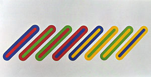
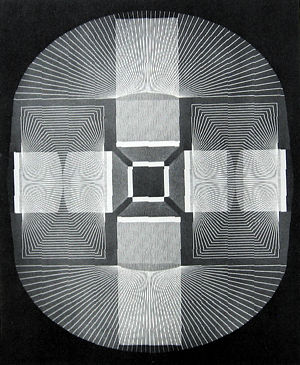
It was from such beginnings that Tousignant came by 1963 to a symmetrical format, from which he developed in 1965 the shaped “optical” canvases that represent his major accomplishment. These works are generally structured by the interlocking of two distinct colour progressions (a strategy which keeps the problem of “taste” from looming too large). They rely particularly on the retinal properties of the eye and its restless saccadic movements, and on this added note of chance making them unpredictable in their effects—their geometry, so carefully constructed, existing paradoxically first to order, then subvert, the colour that it carries. Most recently he has turned to fluorescent paints, to exacerbate hypnotic glare and orgastic excitement, as in his stunning “Octique” in the exhibition.
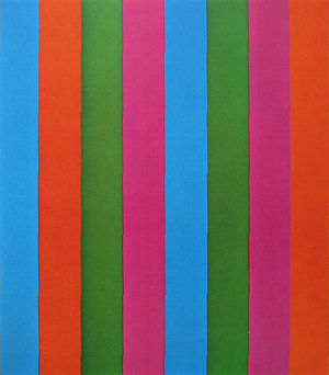
It may seem rhetorical to claim that Molinari is almost the polar opposite. Yet with Molinari the colour is prior—the notation is chosen and the sequence of colour cast exactly to retain the poise that Tousignant so willingly dispenses with, for even if a geometric effect ensues in a work by Tousignant it is a result of the structuring of colour and not of a prior scaffolding. But if Molinari does not aim to seize the eye, he does seek to engage it, like the Baudelairean dandy of old—with a sort of self-deprecating composure. Hence his frequent use of blacks or grays or certain slightly awkward colours; hence his serial repetitions that produce slight changes of resonance in each colour note across the work. By this method of repetition, Molinari implies a discursive, temporal reading of the canvas, which, like the tonalities used, is aimed at mitigating the figure-ground gestalt that Mondrian himself could not elude. Of course, spatial depth is generated, inevitably, but by these means it is not generated consistently, so that the colour hovers near the painted surface and the gestalt potential of the work remains unfirm: just as each hue makes a slight equivocation where it abuts an adjoining colour.
Molinari has been inevitably compared with Gene Davis, but the American, a more sensuous, romantic painter, has little in common with the poised, intellectualizing of the French-Canadian—not even a common source in their use of verticality, which with Molinari, comes from an ambition to further certain European intuitions whereas Davis pays tribute to Barnett Newman (who, incidentally, knew and approved of Molinari’s work). However, Molinari’s recent concerns have led him to a checker-board format, permitting the comparison to lapse.
Jack Bush and Kenneth Lochead
The distance between Tousignant and Molinari, on the one hand, and Jack Bush and Kenneth Lochhead on the other, are at once apparent. The strict formality, the intellectual control, the filmy surface of the paint preferred by the former two (and rooting them in Europe), give way with Bush and Lochhead to a more informal air, an openness of approach, and a typically American surface that cherishes the lint and tooth of the canvas.
With regular New York and London exhibitions, Bush is undoubtedly the most celebrated Canadian painter of today—a surprising fact when one considers that he came to his present style at the age of fifty, after several years in Abstract Expressionism—following encouragement from the U.S. critic Clement Greenberg, in 1957, to explore some implications of an earlier figurative phase. Later, in 1964, he became with Lochhead one of three Canadian painters selected by Greenberg for his definitive “Post Painterly Abstraction” exhibition—from which Molinari seems to have been omitted because of his much earlier affiliations with the art of Mondrian.
In Bush the élan of late Matisse is unmistakable, although partly sublimated by what might be called an existential risk. This risk factor in the work of Bush is higher than that in many “post-painterly” artists, firstly because his concern for quality of surface leaves little scope for the revision of either shape or colour. Bush builds his structures straight onto the canvas, steadily boxing himself into the literal corner of the work and risking all on his ability to grab the final colour passage from the air. Some of these works are breathtaking in their daring, and as they have grown in complexity the chromatic sensitivity demanded of the artist is acute, if he is to bring the work to optimal conclusion.
Like Bush, Kenneth Lockhhead came to colour painting rather dramatically, if by a different route. Lochhead’s change of style is associated with his membership in the late ’fifties in a group of artists in the prairie city of Regina, and his institution of an artists’ workshop with the aim of broadening the basis of Canadian painting there. The visit to this workshop in 1959 of Barnett Newman was followed by reappraisals of their art by several of those present, including Lochhead himself; and perhaps because the Americans Kenneth Noland and Clement Greenberg were later visitors, it is possible to see in Lochhead’s work, as in Bush’s, the presence of “Greenbergian” aesthetics. However, Lochhead’s solution was one among many. Indeed, it has become too easy, in outlining American influence among Canadian artists, to forget that the Canadians who gained from it were themselves sophisticated, often trained in the U.S.A. and Europe (as was Lochhead), and conscious of the same need to forge identity that existed among New York painters of the early forties.
Lochhead’s sense of space can be associated to the wide, high skies of the prairies and the huge scale of fields of wheat and rye, not only in the present paintings but in his much earlier figurative works. Only briefly an abstract expressionist, however, he eschews the tensions and resolutions that arise through Bush’s risk-taking method of abutting each passage of colour. Lochhead prefers to let the painting “breathe” by leaving margins of unpainted canvas between the colour passages—or sometimes, as in the painting “Green Session,” to overlay or bleed the margin of one colour into the other; either way, the effect of optical flicker is reduced, together with the push and pull of tonal values, in favor of a more languid sensuality, especially in the paintings in the exhibition.
The Sculpture of Robert Murray
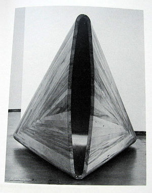
Robert Murray also originates from the prairies. Trained as a painter in the late ’fifties at the University of Saskatchewan (where Lochhead was already teaching), Murray turned to sculpture just before moving to New York in 1960. From the start his sculptures were eminently readable: the forms large, the syntax uncomplicated, the surfaces uniform. The earliest works were mostly columnar and, in spite of their simplicity, had a totemic air—which only disappeared when he began to use two forms articulated by a welded bar or beam, but sometimes free-standing, as in the sculpture “TO,” of 1963, which is in the exhibition. This work, which from a bird’s eye view takes on the configuration of a “T” and an “O,” has at the same time a certain anthropomorphic personality which Murray appears to have accepted in several works of that time. Later, when a horizontal emphasis began to appear, titles like “Breaker” (1965), “Water Shed” (1966), “Track” (1966), “Surf”(1967) and “Wave” (1967) bore an obvious relationship to the works they name. Even a title like “Pueblo” (1968) resonates with the piece – though, with the breadth we always find in Murray, this resonance is faint, and its almost whimsical quality serves to lighten the work rather than to impress heavily upon it. Indeed some of the later planar pieces, with their flatly coloured surfaces, sweep into vision with the airy grace of Lochhead’s painting.
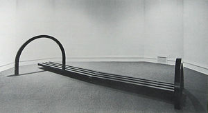
Murry took a significant step in 1964 when, like David Smith and Anthony Caro before him, he decided to discard the base plate that he had up to then been using, a rejection which has liberated sculptural form in the way that the use of un-primed canvas liberated colour from the tacky constraints of the priming coat. Behind this descent from the plinth and the base plate, there has been, at least in part, the coercion of large scale, which Murray has come to, like a number of other sculptors, through his recourse to industrial methods of fabrication—even the impressive scale of a piece like “Pueblo” is diminished by the shipyard in which it is constructed. On the other hand, where even in large scale pieces Smith or Caro may coax an illusion of weightlessness out of their material, Murray’s syntax always lets the weight of his material show—sometimes rather statically through flanged articulations as in “Pueblo,” or sometimes more dynamically by welding the abutted corners of two planes or struts so that their frail articulation seems threatened by the stress involved. This is no arbitrary distinction, for where it may be held of Caro that his work relates to the gesture, emotion and stance of the human body, Murray may have become, as his titles indicate, the sculptor of an elusive kind of landscape art. Less obviously passionate than Smith or Caro, his work is made to manifest that thrust and structure, camber and flow of the terrain that we all know, as well as the architecture that grows from it, the gating and bridging that melds into it, or the leap and bicker of its streams and torrents.
The Sculpture of Zelenak, Beveridge and Rabinovitch
The remaining sculptors in the exhibition approach their task in completely different ways. Zelenak’s acutely plastic sensibility, once nearer to Murray’s, now concerns itself with molded forms, while Rabinowitch deals with more resistant material and Beveridge conjures poignant spatial and material juxtapositions from the industrial waste of New York City.
Educated at art colleges in Toronto and Fort Worth, Texas, Zelenak, like Murray came to sculpture from painting. His method of “working-up” a painting into a sort of wall-hanging assemblage, using great gobs of plaster to anchor elements like chicken wire, wood shards and crumpled tin, led inexorably to three-dimensional works. In fact, back in rural Ontario in 1962, after his years at Fort Worth (from where he had assisted Claes Oldenburg install his Store Days at nearby Dallas), Zelenak produced from barn-wood, discarded beams and other rural detritus a series of totemic structures like “stabile” predecessors of the mobiles of the American, Mark di Suvero. What these sculptures established for Zelenak, however, was a lasting obsession with scale, a concern which caused him in 1964-5 to build a new studio. Here, he left behind the hairy aesthetic of assemblage and turned to working with sheet steel (or plywood) in a manner reminiscent partly of Murray and partly of Tony Smith—sometimes penetrating or cleaving space and sometimes enclosing it in sphinx-like housings.
The “sublime” aspect of large scale has not disappeared from Zelenak’s work, even though in 1968 he began to turn to a more practical material (fiberglass) and to organic as well as architectural structures. This transition like those earlier was logical and smooth; Zelenak had built the studio with the Canadian sculptor Walter Redinger, who had already used fiberglass for some time, and, turning to this material to make a curved upper surface for one of his cuboid housings, Zelenak discovered the possibility of visceral, convolving forms and delicate translucency. It is these that represent him in the present exhibition.
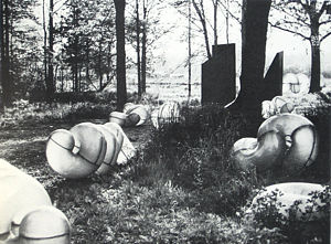
As in the earlier pieces of large scale and enigmatic presence, the giant forms that Zelenak has created from his new (modular) elements have a Surreal overtone—partly generated by the unexpected contexts in which they may be placed—their regularity of structure giving them the aspect of an alienated industrial plant. On a more human scale, like that used in the exhibition, he departs perhaps inevitably from this Surrealist use of “chance encounter,” in favor of effects which one can find elsewhere only on the West Coast, in the obsession of Los Angeles with subtle light and surface and in the scatological undercurrents and turgid erotica of San Francisco Funk Art. It is this fusion, brought about, not eclectically but by a concern for the properties of the material itself, that makes these sculptures so hypnotic and in their flayed and tightly curving surfaces such an exquisite metaphor for pleasure-pain.
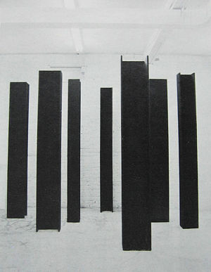
Most of Karl Beveridge’s work over the past four years has been floor sculpture: many pieces stood no higher than the thickness of the strip-wood, planks or rods of which they were composed. This is still true in some examples of his work, which has evolved over the period towards a more lyrical expression as a result of Beveridge’s changing attitude towards material. His work four years ago was formalistic—a typical piece would remind one of a monochrome evenly-slatted gate, which either lay on the floor, commandeering the space above, or tilted to make a shallow fence. The relation of these works to “modernist” painting was clear: in some ways one might have been looking at a translation of Frank Stella. But Beveridge came to use rods instead of slats, and his compositions opened up. Later still he chose to reject painted surfaces for the natural quality of the materials; and these began to get increasingly various—plain pine boards, expanded steel mesh, steel bars and chains and plioform sheets appeared and the compositions became less intricate as these materials proliferated. Such preoccupations. of course, are not unique to Beveridge—the poignant juxtaposing of disparate materials has been a factor in art throughout the century, and phenomenological writing, besides giving something to followers of Duchamp. has helped clarify issues also for artists who have looked back to Brancusi. Typically such artists have been at some point reductionist and formalist; Kolisnyk for instance in his bare canvas works must count among them, and the earlier work of Beveridge may be read as a pointer to his present position, now that the common dialectic has become clear. If the works these artists have produced seem austere, however, this is, in more than one case, an Epicurean austerity, and even though many may be said to have become “post studio” artists, ordering their material pre-cut from the supplier, it is clear that individual sensibilities exist, and Beveridge’s among them.
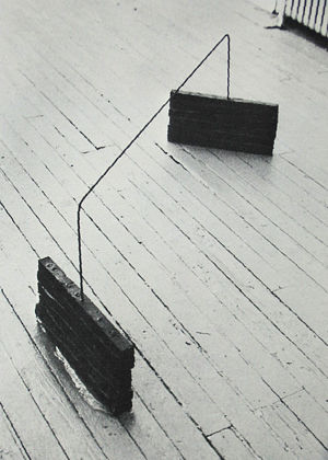
In each piece by Beveridge, the materials hold together not only by virtue of the space that they describe but also through the sympathy in their confrontation. Such unlikely partnerships of material as Beveridge has found result from the pragmatic response to a sculptor’s problem called forth by living in one of the great scrap-yards of the world—New York’s Lower East Side. This often means that his materials have accreted a patina of use or exposure (fabric is stained or creased, metal rusted or corroded, and so on) which would have qualified them to appear in The Art of Assemblage exhibition at the Museum of Modern Art in 1961, The difference is that then they would have been used to establish a Surrealistic ‘presence” or a neo-Dadaist enigma. Beveridge, however, in common with most of his peers, is careful to avoid any hint of this, as of Expressionism. True, there is a sort of pathos in such material that he does not suppress, and the formal elegance of his solutions may sometimes seem to add to it. What serves to mitigate this overtone, however, is their manner of articulation, which is always forthright and mostly predicated on inherent qualities (rigid materials lie, lean or prop, fabrics are spread, blocks stack, rods penetrate). These reticent but nimble structures thus insert the merest breath of fact into their world of rehabilitated value.
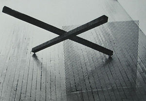
David Rabinowitch was an intense admirer of David Smith in his early teens, read Kant and Spinoza at high school and had a switch-back university career in physics and honors English before committing himself to sculpture in 1966. Today, however, the influence of Smith is vestigial, persisting only in Rabinowitch’s use of ferrous metals; and the older artist’s exuberant expressiveness has been displaced by enigmatic matters. One often gets from Rabinowitch’s work the impression of a topologist intoxicated with the wayward aspects of his trade—with, for instance, the fact that an airscrew or some other formulated surface is not knowable to perception in minute particulars. This fascination for what is ungraspable in the obvious has led Rabinowitch, using shipbuilding and other industrial methods, to construct forms somewhat like the hulls of boats with surfaces that change at constant rates, or to expand or contract the diameters of metal tubes, and twist this distortion axially over such a length that perception cannot grasp that the event has actually happened (for example, one such tube is forty feet in length).
In the present exhibition, however, Rabinowitch reveals instead an absorbtion with interiority and exteriority, in his treatment of these inert and unaccommodating objects. The earlier series of much longer, narrower pipes is mostly given a special finish, perhaps by sand-blasting, which seems to focus attention on the elusive transformation that their surfaces undergo. Here, instead, he leaves the tubes with their industrial finish inside and out. Then, too, one has been plugged with wax, as if to invite us to sense more acutely the interior surface by empathizing with the way the wax must pack against it; or another is drilled randomly with holes that make it seem permeable; and two more have been made as if to imply dissection along the axis or diameter—as if, say, in the case of “Many-sided Piece,” the tube could be equated with a sandwich as the number of facets was progressively reduced (the artist insists that this work be installed with its two elements vertically opposed, for instance). It is as if he were, like Snow, a sort of non-verbal philosopher, exasperated with the limitations of knowledge and perception—with the fact that one cannot perceive both inside and outside, recto and verso, in one moment of completely lucid apprehension.
It seems fitting to conclude these notes with Beveridge and Rabinowitch, the youngest artists in the exhibition. What remains to be asked is whether, in the next one, they will be the oldest. There is no question that the generation just behind them is much larger and better informed than any that have gone before, nor that it is willing to commit the Oedipal assault. What is unclear, however, is the weapon it will use. Canadian art, like that elsewhere, looks back at a quarter of a century of what seemed then perpetual revolution but was really the consolidation of two distinct traditions - stemming from Cubism and Surrealism on the one hand, and Dadaism and Duchamp on the other. Of course, there have been alternatives, and Fisher, Chambers and Meredith stand out, but most options have proved theatrical, or decorative by-ways, or popular travesties. Tomorrow’s radical art, in other words, is less likely to come from plastic than from political intuitions (Baxter’s social commitment is particularly interesting in this respect); the plastic alternative seems to be a more modest, eclectic consolidation of what has gone before. There is every indication that for many this will be the answer. Without it, one may even ask will plastic art survive.
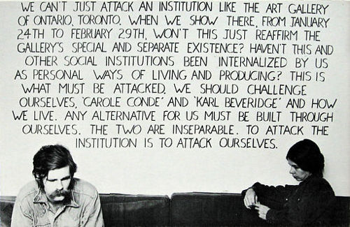
[Note: In respect to my prognostications in the above last paragraph of the catalogue, I thought it interesting to include an illustration of the existential struggle that political involvement was to bring to the work of Karl Beveridge and his wife Carole Condé who were to renounce the plastic works that Beveridge had shown soon after the exhibition had returned to Canada.]